| All material on this site is Copyright by Dean Gardiner. No material from this site may be used in any form without express permission of the copyright owner. |
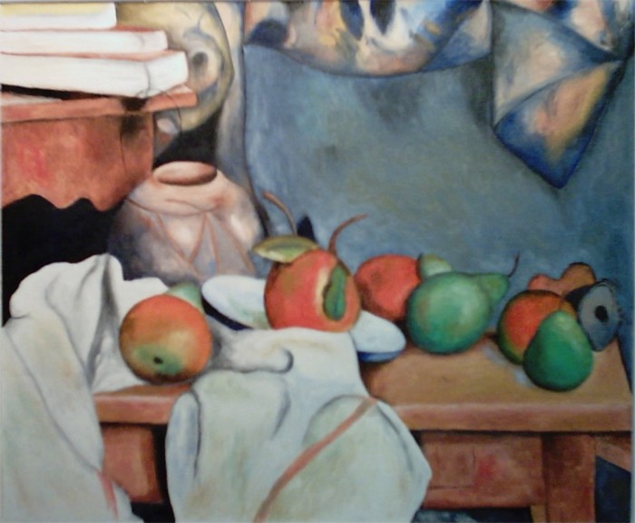
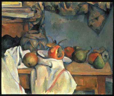
Ginger Pot with Pomegranates and Pears
Here is my study of this work.
And here is the original.
It was thanks to Cezanne and the extraordinary exhibition at the Art Gallery of New South Wales in 1998 that inspired me to return to art after a long absence. I bought a set of water colors at the gallery shop when I walked out of the door. After the exhibition I read everything I could find on Cezanne and I went back for a second viewing before the show moved on. Prior to this I had never really been exposed to Cezanne's work, but afterwards I saw Cezanne's influence in the work of most modern artists.
I have never really been convinced that the impressionists really succeeded in building depth through color. It is an exercise that has been thoroughly exhausted through constant experimentation with no compelling results. After all, does it really matter if black is simply replaced by a very dark blue? However the use of blue in place of black does present another difficulty that obsessed the impressionists and is also a feature of this particular work. That is the notion that cool colors recede. In my opinion that presented a greater challenge to the impressionists than the loss of tone. Cezanne handles this problem remarkably, purely by sheer force of composition. This is really an extraordinary work.
There is really so much happening in this painting with respect to the simplicity and primacy of colors in Cezanne's palette. It makes an absolutely compelling study that is difficult to do justice to. When I painted this picture I never really understood Cezanne's colors. They seemed somewhat haphazard, even arbitrary. That was until I had the good fortune to visit Cezanne's studio in Aix en Provence back in late 2000. The interior of the studio is painted a drab grey, and light streams in through a large glass window that must have had an awesome view of the town at one time. Suddenly not only did the colors make sense but it became obvious that they were the only possible colors that could have been used. The light is so different from Australia.
Anyway these were my chief preoccupations when I did this study. The overwhelming interplay between color and the relative values of the large warm and cool areas of the painting dominated my thinking. I tried to incorporate tonal elements in contrast to the impressionist approach, while still attempting to retain the fundamental identity of Cezanne's work. As such the warm and cool areas are framed, if you like. The use of black in the study cheats by eliminating the cause one of the major problems. The question remains, does this prove or deny the notion that different colors can inherently imply depth?